
A whole life insurance illustration tracked its actual performance within 1.85% over 20 years in a Penn Mutual policy issued in 2005: $322,963 of real cash value against $329,042 projected, on $211,800 of premium. The first 13 years matched dollar for dollar.
Every whole life policy in America is sold off a document that projects sixty years of numbers the carrier is not obligated to deliver. The guaranteed column is contractual. Everything above it depends on a dividend that gets declared one year at a time. Buyers sign, file the illustration in a drawer, and almost nobody goes back two decades later to check the work.
An illustration is a projection, and the only thing that makes it credible is a carrier's track record of delivering close to what it projected. That record is testable. It requires the original as-sold illustration, a current in-force illustration on the same contract, and a policyholder who funded it the way it was designed.
We found that combination. A Penn Mutual policy written in 2005 on a 37-year-old male, preferred non-tobacco, funded at $10,590 a year for 20 consecutive years, paid at the start of each policy year exactly as illustrated. At BetterWealth we have structured more than 2,000 policies across all 50 states, and we are rarely handed a cleaner apples-to-apples test than this one.
This article walks the 20-year comparison line by line, explains why the first 13 years came in identical, runs the same $10,590 premium through a modern overfunded design to show what changes when the structure changes, and covers a second policy at a different carrier that is currently ahead of its own projection at year six. It also covers what none of this proves, because a carrier tracking its illustration says nothing about whether borrowing against the policy will make you money.
- Actual cash value came in at $322,963 against $329,042 illustrated 20 years earlier, a gap of 1.85%.
- The original and in-force illustrations matched dollar for dollar for 13 straight years, through the 2008 financial crisis.
- Penn Mutual illustrated that 2005 policy at a 6.3% dividend interest rate when competitors were projecting higher.
- The same $10,590 premium in a modern overfunded design projects $351,570 of cash value at year 20.
- Tracking an illustration is a carrier test. Whether the strategy pays is a separate question about the loan rate.
The video puts both illustrations on screen side by side, so you can watch the rows line up year by year and see Caleb react to the dividend rate reveal before he knows the number:
01 / The problemWhy nobody checks whether the illustration was true
Almost no one audits a life insurance illustration after the fact, because the two documents required to do it rarely sit in the same place. The as-sold illustration lives in a client file or a drawer. The in-force illustration has to be requested from the carrier. Twenty years later the agent has often moved on, the client has stopped opening the annual statement, and the only number anyone looks at is the current cash value in isolation.
That gap is where the credibility of the entire industry gets decided. A buyer evaluating whole life today is being asked to accept a sixty-year projection from a company whose record they cannot see. Agents fill that vacuum with adjectives. Skeptics fill it with the assumption that every projection is inflated.
Both are guessing. The test is cheap to run and almost nobody runs it.
Illustrations mean very little on their own. Anyone can produce an illustration. What matters is whether the company behind it delivered.
02 / The resultWhat did the 20-year Penn Mutual test actually show?
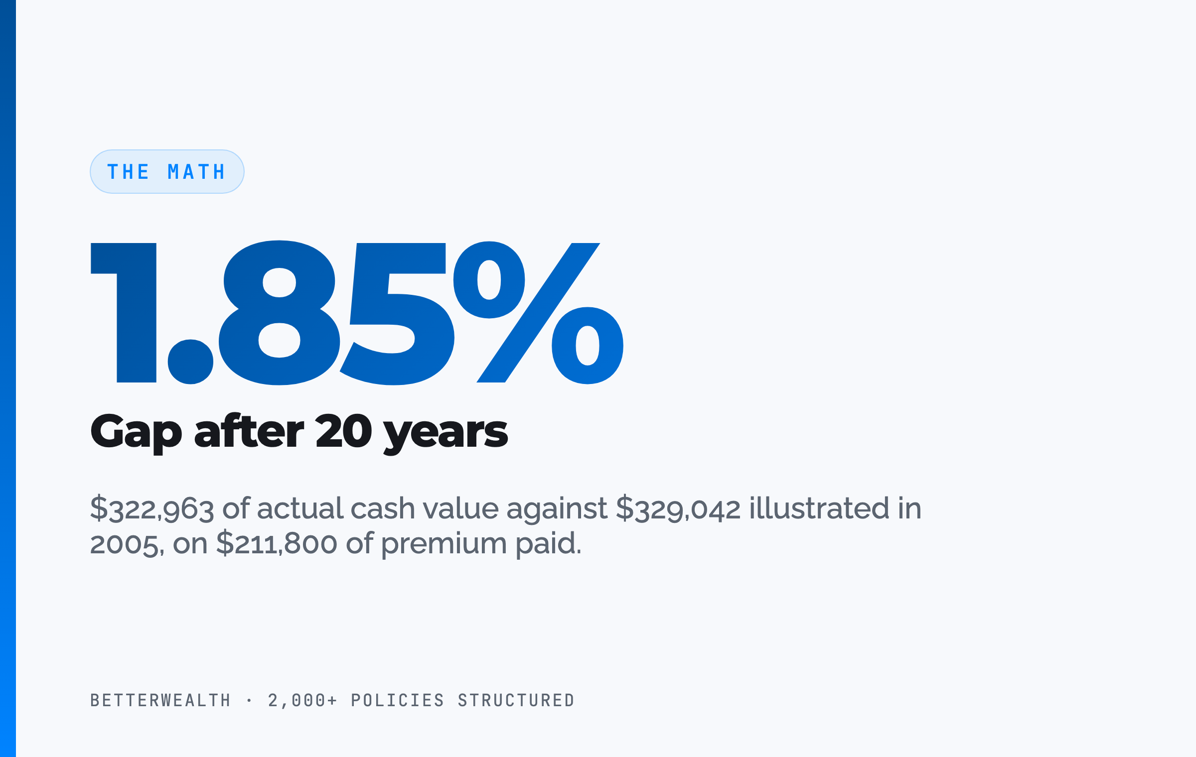
The policy landed 1.85% below its original cash value projection after 20 years. The 2005 illustration showed $329,042 of cash value at year 20. The in-force illustration run this year shows $322,963. The gap is $6,079 on $211,800 of premium paid.
Death benefit tells a similar story. The original projected $918,170 at year 20. The in-force figure is $896,648, a difference of $21,522. The policyholder currently holds more than four times his cumulative contributions in death benefit and roughly 52% more in cash value than he has paid in.
The early years are the part worth studying. Year one cash value was zero on both documents. Year two, after more than $21,000 of premium, showed $3,000 on both. Thirteen years in, at 2018, both documents read $147,424 of cash value and $782,770 of death benefit. Identical. That period contains the 2008 financial crisis, a decade of rate compression, and multiple leadership changes at the carrier.
Thirteen years. Dollar for dollar.
Values began to drift slightly in 2019 and the drift is what produced the final $6,079. Anyone expecting whole life to hold a projection perfectly across two decades is expecting the wrong thing, since dividends are declared annually and are never guaranteed. A sub-2% variance over 20 years is a carrier doing what it said it would do.
03 / The frameworkWhat is The And Asset, and how is it different from infinite banking?
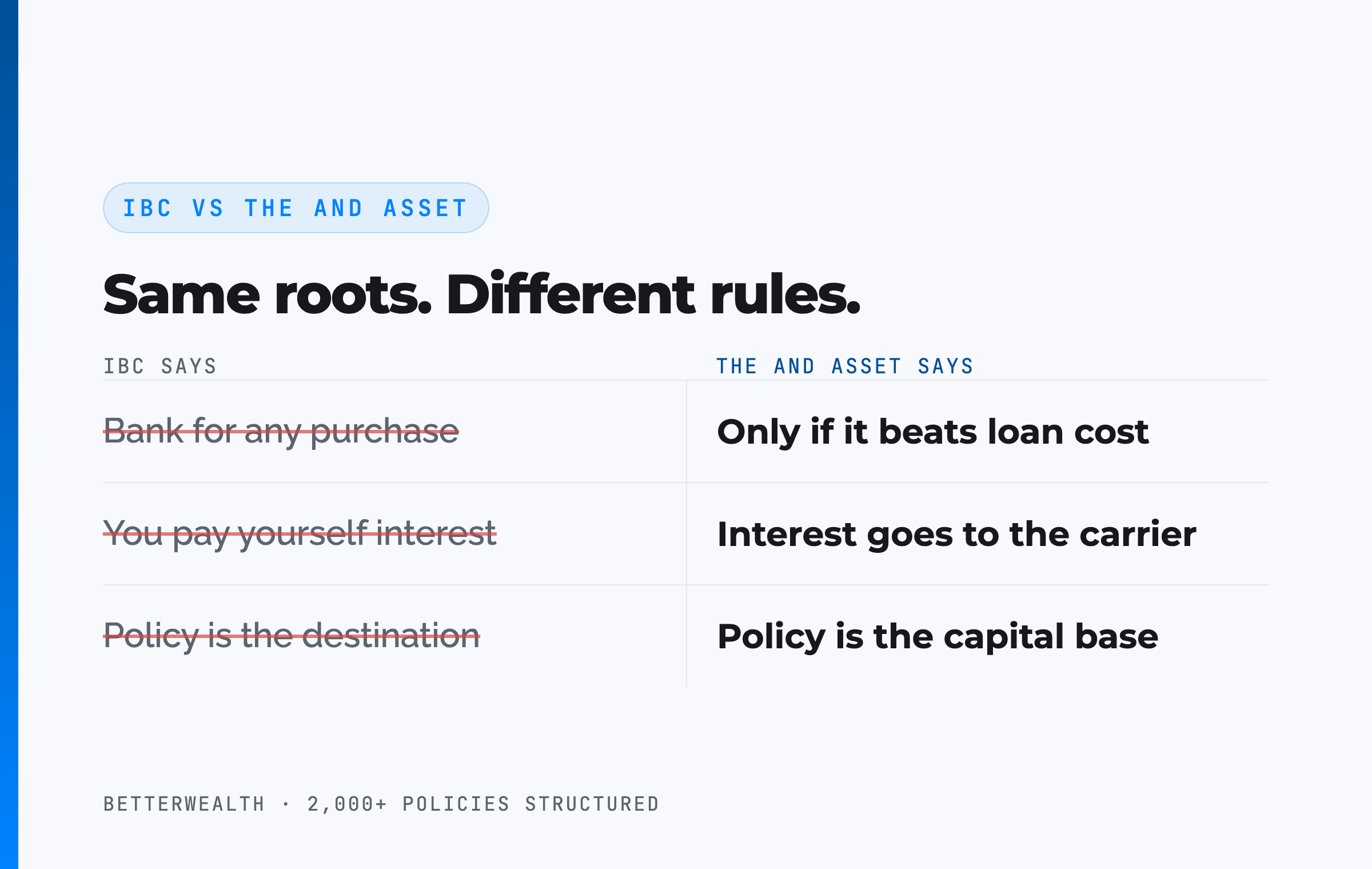
The And Asset is BetterWealth's framework for treating a properly structured whole life policy as a capital base you borrow against, under one rule: the borrowed dollars must produce a return greater than the carrier's loan cost. Nelson Nash pioneered the idea of using whole life as a personal banking system in Becoming Your Own Banker, and his insight about lost opportunity cost is the foundation we build on.
Where the two frameworks separate
IBC says a whole life policy can function as a personal bank for any purchase. The And Asset says you only deploy capital when the return on that deployment clears the carrier's loan rate, because anything less is an expensive way to spend money. Many IBC marketers say you pay yourself interest. You do not. The interest goes to the carrier. Your return is whatever the deployed capital earns while the policy keeps compounding at the dividend rate net of mortality and expense charges.
The distinction matters directly to this test. A policy that tracks its illustration proves the carrier is sound. It proves nothing about whether the strategy works for you, because that depends entirely on what you do with the capital. The And Asset shares roots with IBC and operates on different principles.
Marketers have ruined how this gets explained. A carrier hitting its projection is not a reason to buy. The reason to buy is a use for the capital that beats the loan cost.
04 / How to run itHow do you test a policy illustration against actual performance?
You test an illustration by placing the original as-sold document next to a current in-force illustration and reading the same policy year off both. Six steps, in order.
- Pull the original as-sold illustration. This is the document signed at application. It carries projected cash value and death benefit for every policy year, run at the dividend interest rate in effect the year the policy was issued.
- Request a current in-force illustration. The carrier or your agent produces it. It shows actual values to date and reprojects the remaining years at today's dividend scale.
- Confirm the funding actually matched. Every premium paid in the illustrated amount, at the illustrated time of year. The policy in this test was funded at the start of each policy year, which is why the rows line up so cleanly. A policy funded late or short will trail its illustration for reasons that have nothing to do with the carrier.
- Line up the same policy years. Policy year to policy year, not calendar year to calendar year. Read cash value and death benefit off the same row in both documents.
- Compute the dollar gap and the percentage. Projected cash value minus actual, divided by projected. In this case $329,042 minus $322,963, divided by $329,042, equals 1.85%.
- Check the dividend rate at issue. Compare the rate the original was run at to the carrier's current declared rate. This single input explains more variance than anything else on the page.
Step six is where this test got interesting, and it is the step almost every comparison skips.
05 / The mechanismWhy did the first 13 years track so closely?
The first 13 years tracked because Penn Mutual illustrated conservatively at issue and because a mutual carrier's general account moves slowly. The 2005 illustration was run at a 6.3% dividend interest rate. Competitors at the time were projecting higher, and a 6.3% assumption in 2005 looked timid against a decade of falling rates that had not yet fully worked through the industry.
The second reason is structural. Carriers hold the bulk of their general account in investment grade bonds, often upward of 70%, and they hold them to maturity. In 2005, Penn Mutual was still collecting coupons on bonds bought in the 1980s at yields no one can get today. Those holdings do not reprice when the equity market falls. A policy issued in 2005 rode through 2008 because the assets backing it were purchased decades before the crisis and kept paying as though it never happened.
The same logic running in reverse
Rates fell for four decades and carriers absorbed it slowly, which is why dividends drifted down rather than dropping. That buffer works in both directions. Rates have risen off their lows, and the high-coupon bonds bought in the 1980s have rolled off, so today's illustrations are built on a lower-yielding portfolio than the one behind the 2005 document. The current illustration at Penn Mutual reflects what the company is actually sitting on rather than what it wishes it were sitting on. Conservative projections are not a weakness. They are the reason a 20-year-old illustration still holds.
Slow to fall. Slow to rise. That is the general account.
A policy that tracks its illustration is not a reason to own one.
This fits you if
- You deploy capital already and can name a use that beats the loan cost
- You have a 10-year-plus horizon and steady funding capacity
- You want to verify a carrier's record before you commit
- You own a policy and have never checked it against its illustration
This does not fit you if
- You want a savings account with a better rate
- You are carrying high-interest debt and need liquidity now
- You expect the policy itself to outperform your investments
- You cannot identify a productive use for borrowed dollars
If you are in the first column, 30 minutes will tell you whether a design like this belongs in your capital structure. If you are in the second, we will say that instead.
Book a Discovery Call06 / The designWhat changes when the same premium is structured for cash value?
The design drives early liquidity far more than the carrier does, and the 2005 policy proves it in the harshest way possible: year one cash value of zero. That policy was built entirely with base premium. No paid-up additions rider, no term rider, no attempt at early access. The buyer wanted permanent death benefit and a disability waiver of premium that keeps the contract funded if he could not work, and $750,000 of day-one death benefit is exactly what the structure delivered.
Run the identical $10,590 through Penn Mutual's Accumulation Whole Life today as an overfunded design and the premium splits three ways: $1,285 of base, $835 into the flexible protection term rider, and $8,470 into the enhanced permanent paid-up additions rider. The paid-up additions rider is the engine. The term rider carries enough death benefit to keep the contract inside the IRS limit so the policy does not become a Modified Endowment Contract.
That design projects $351,570 of cash value and $828,165 of death benefit at year 20. Against the 2005 all-base projection, that is roughly $22,500 more cash value and about $90,000 less death benefit. Starting death benefit drops from $750,000 to under $300,000. Year one cash value runs 77 to 87% of premium at Penn Mutual instead of zero.
Roughly half of that extra cash value comes from the dividend rate assumption and the rest from a product built for accumulation, since Penn Mutual now separates Accumulation Whole Life from Protection Whole Life where the 2005 contract had to serve both purposes. A buyer who wants the death benefit back adds a 20 or 30-year term policy alongside, and the term premium comes out of the same budget, which pulls cash value down slightly. Design is the decision that drives outcomes, and it is made once, at application.
A design built for death benefit will never behave like a design built for cash value. Blaming the carrier for that is blaming the wrong thing.
07 / Head to headThe same $10,590, three different structures
Identical premium produces radically different outcomes depending on the split between base premium, term rider, and paid-up additions. The table holds premium constant at $10,590 and shows where the dollars land.
| Dimension | 2005 all-base, as sold | 2005 all-base, actual 2026 | 2026 overfunded And Asset design |
|---|---|---|---|
| Annual premium | $10,590 | $10,590 | $10,590 |
| Premium split | 100% base premium | 100% base premium | $1,285 base / $835 term rider / $8,470 PUA |
| Year 1 cash value | $0 | $0 | $8,154 to $9,213 (77 to 87% of premium) |
| Year 1 death benefit | $750,000 | $750,000 | Under $300,000 |
| Year 20 cash value | $329,042 | $322,963 | $351,570 projected |
| Year 20 death benefit | $918,170 | $896,648 | $828,165 projected |
Early liquidity. The all-base policy held nothing usable for the first several years, and $3,000 after two years of $10,590 premiums is not capital you can deploy. The overfunded design puts roughly $8,150 to $9,210 to work in year one, which is the entire point of overfunding a contract.
Long-term cash value. Twenty years out the spread narrows to about $28,600 between the actual all-base result and the projected overfunded result. The gap in the first decade is far wider, which is where the strategy either functions or sits idle.
Death benefit. All-base wins on death benefit and it is not close, $750,000 on day one against under $300,000. A buyer who needs both buys term alongside the overfunded policy. There is no structure that maximizes both at the same premium.
08 / The mathDoes the deployed return clear the carrier's loan cost?
The return on whatever you deploy must exceed the carrier's loan cost, or you should not borrow. Nothing in a 20-year illustration test changes that threshold. Loan rates vary by carrier and by rate environment, and many carriers sit in the 5 to 6% range at the time of writing, so treat any specific figure as a number to verify with the carrier rather than a constant.
Penn Mutual is a direct recognition carrier, which shapes this math in a way worth knowing. It guarantees a 0.65% spread between the loan rate and the dividend rate in policy years 1 through 10, and a 0% spread from year 11 onward. Your cost of borrowing is a known quantity rather than a moving target, which is why the design suits people planning to take policy income later.
The structure of the decision is simple. You borrow at the carrier's rate. The policy continues compounding on its full cash value, adjusted by the direct recognition spread. Your deployed capital earns its own return. Clear the loan cost and one dollar has done two jobs. Fall short and you borrowed money to lose money slowly.
If the deal does not clear the loan rate, do not borrow.
The same premium, deployed: a worked dollar walkthrough
The 2005 policy in this test was never borrowed against, so the deployment math below is a composite built on the modern overfunded design at the same $10,590 premium. It reflects what we see across 2,000+ policies rather than a single named client.
The premium splits $1,285 base, $835 term rider, $8,470 paid-up additions. Year one cash value of $8,740 sits below the $10,590 contributed, and it stays below cumulative contributions through year five. Cash value crosses total contributions in year six at $64,880 against $63,540 paid in. Any illustration showing break-even earlier than that is marketing fiction.
By year 12 the policyholder has contributed $127,080 and holds $158,470 of cash value. A piece of revenue-producing equipment comes up and she borrows $92,000 against the policy. At an illustrative 6% loan rate, first-year interest runs $5,520. The equipment produces a 13.1% return on the deployed capital, or $12,052 in that first year. The spread is $6,532 in her favor, and the policy keeps compounding on its full cash value the entire time. At year 12 the direct recognition spread at Penn Mutual is 0%, so the loan rate and the credited rate move together.
Repayment runs on a 41-month schedule funded by the equipment's own cash flow. By year 20 the policy is projected at $351,570 of cash value regardless, because the loan was collateralized rather than withdrawn.
One dollar. Two jobs. That is the And.
The frameworks behind 2,000+ policies, in one place.
The And Asset Vault holds the calculators, design frameworks, and structuring decisions we use when we build and stress-test policies like the ones in this article. Free, email-gated, no spam.
Open the Vault09 / The second testCan a policy beat its own illustration?
Yes, and the second policy in this test is currently doing it. A 32-year-old woman funded a Lafayette Life contract with $64,000 in year one followed by $40,000 a year, paid exactly as scheduled. At year six the as-sold illustration projected $253,171 of cash value and $3,933,000 of death benefit. The in-force illustration shows $254,084 of cash value and $3,937,535 of death benefit. Slightly ahead on both.
The annual dividend is running ahead of projection as well. Year six was illustrated at $3,246 and the current projection is higher. Lafayette Life has raised its dividend since the policy was issued, and the policy was sold in a lower rate environment, so the assumptions baked in at issue were conservative relative to where the company sits now.
Lafayette Life is a non-direct recognition carrier operating under Western and Southern, rated A+ by AM Best with a COMDEX of 95 and a 2026 projected dividend interest rate of 5.9%. Different carrier, different recognition type, same pattern: illustrate conservatively and let the policyholder be pleasantly surprised.
We may be entering a stretch where this becomes common. Carriers have spent four decades either holding dividends flat or cutting them. Several are now raising, and a policy illustrated at the bottom of the rate cycle has room to outperform the document it was sold on.
10 / Where people get it wrongThe four mistakes this test exposes
Four errors show up constantly in how both sides of this debate use illustrations, and all four are visible in these two policies.
The first is treating the illustration as a promise. It is a projection built on a dividend scale that gets re-declared every year. The guaranteed column at Penn Mutual grows cash value at roughly 3% over the life of the policy, less early and more later, and that is the only part the company is contractually bound to.
The second is judging a carrier by the design. A policy showing zero cash value in year one was designed for death benefit. That is a structural outcome of an all-base contract, not evidence of a weak company.
The third is the dividend rate beauty contest. A carrier illustrating at 8% in 2005 would have looked better on paper and worse in 2026. Penn Mutual illustrated at 6.3%, absorbed being outshone in the sales process, and delivered. The dividend rate is gross. Actual growth is that rate net of mortality and expense charges.
The fourth is the one we care about most. A carrier hitting its projection does not make the strategy work for you. The And Asset only creates value when the borrowed dollars out-earn the loan cost, and no illustration on earth can tell you whether you have a use for capital that does.
This is not a Penn Mutual commercial. We will run this test on any carrier, including indexed universal life, and publish what we find either way.
11 / The tradeoffsWhat this test proves and what it does not
The test proves three things and leaves several open. It proves that a conservatively illustrated policy at a strong mutual carrier can track within 2% of projection across 20 years that included a financial crisis. It proves that funding discipline matters, since the policyholder paid every premium on time and in full. It proves that early cash value is a design decision rather than a carrier decision.
What it does not prove is more interesting. Twenty years is 20 years, not 100. One policy at one carrier is not a data set. The 2005 contract carried a disability waiver of premium that added cost and would keep the policy funded if the owner could not work, so it is not a pure accumulation comparison. And the modern illustration is a projection running forward from today, subject to exactly the same uncertainty the 2005 document carried.
The honest read: Penn Mutual delivered close to what it said it would, and Lafayette Life is currently ahead of what it said it would. Neither fact tells you whether you should own one of these.
Time exposes a lot. Twenty years exposed very little here.
Send us a policy and we will run this test on it.
If you own a policy that is 10 years old or older, we will pull the in-force illustration, line it up against the original, and tell you what the carrier actually delivered. We have structured more than 2,000 policies across all 50 states. If you would rather learn first, the The And Asset and BetterWealth YouTube channels go deep on the math.
Book a Discovery CallFAQIllustration vs actual performance questions
Do whole life insurance illustrations match actual performance?
A well-designed policy at a conservative mutual carrier tracks close to its illustration. In the 20-year Penn Mutual policy we tested, actual cash value came in 1.85% below the original projection, and the first 13 policy years matched dollar for dollar. Dividends are declared annually and are never guaranteed, so a gap in either direction is normal.
What was the gap between illustrated and actual in this 20-year Penn Mutual policy?
The gap was $6,079 of cash value, or 1.85%. The 2005 illustration projected $329,042 of cash value at year 20. The 2026 in-force illustration shows $322,963 on $211,800 of total premium. Death benefit came in at $896,648 against $918,170 projected, a difference of $21,522.
What is The And Asset?
The And Asset is BetterWealth's framework for using a properly structured whole life policy as a capital base. You only borrow against it for an activity that produces a return greater than the carrier's loan cost, so your dollars do two jobs at once: the policy keeps compounding while the deployed capital earns its own return.
How is The And Asset different from infinite banking?
Infinite banking, as Nelson Nash taught it, frames a whole life policy as a personal banking system for any purchase. The And Asset says you only deploy borrowed capital when the return clears the carrier's loan cost. The policy is the capital base, not the destination. It is built on Nash's foundation and operates on different principles.
What is an in-force illustration?
An in-force illustration is a document the carrier produces on a policy that already exists, showing actual values to date and reprojecting future years at the current dividend scale. It is the only way to compare what a policy has done against what it was projected to do.
Why was the cash value zero in the first year of this policy?
The 2005 policy was funded entirely with base premium and no paid-up additions rider, which is a design built for permanent death benefit rather than early liquidity. All-base whole life commonly shows zero or near-zero cash value in year one. An overfunded design loaded with a paid-up additions rider shows 77 to 87% of premium as cash value in year one at Penn Mutual.
What was Penn Mutual's dividend interest rate in 2005?
Penn Mutual's 2005 illustration on this policy was run at a 6.3% dividend interest rate. That was conservative for the period, when long-term corporate bond yields were higher and several competitors illustrated at materially higher rates. Penn Mutual's projected rate for 2026 is 6.1%.
Are whole life dividends guaranteed?
No. Dividends are declared annually by the carrier's board and are not guaranteed. The guaranteed column of a Penn Mutual illustration runs at roughly 3% of cash value growth over the life of the policy, less in the early years and more in the later years. Everything above that line depends on the dividend scale holding.
Is Penn Mutual direct or non-direct recognition?
Penn Mutual is a direct recognition carrier. It guarantees a 0.65% spread between the loan rate and the dividend rate in policy years 1 through 10, and a 0% spread from year 11 onward. Lafayette Life, the second carrier in this test, is non-direct recognition.
Why does an overfunded policy show a lower death benefit than an all-base policy?
An overfunded design buys the minimum death benefit the IRS allows for the premium, so more of each dollar goes to cash value. On identical $10,590 premiums, the all-base 2005 design started at $750,000 of death benefit while the modern overfunded design starts under $300,000 and carries $828,165 by year 20. Buyers who want both usually add a term policy alongside.
Did the Lafayette Life policy beat its illustration?
Yes. At year six the original illustration projected $253,171 of cash value and $3,933,000 of death benefit. The in-force illustration shows $254,084 of cash value and $3,937,535 of death benefit. The policy was sold in a lower interest rate environment and Lafayette Life has raised its dividend since.
Can BetterWealth test my policy against its original illustration?
Yes. We run this comparison on any carrier and any product, including indexed universal life, and the older the policy the more useful the result. Bring the original as-sold illustration and we will pull a current in-force illustration and line them up. Book a discovery call at betterwealth.com/discovery-call.
Is Penn Mutual available in New York?
No. Penn Mutual does not sell its core whole life products in New York. It operates in 49 states plus Washington DC. New York residents need a different carrier for an And Asset policy.
- Nelson Nash, Becoming Your Own Banker. The origin of the infinite banking concept.
- IRC Section 7702 (Cornell Law). The tax code provision behind the treatment of life insurance cash value and policy loans.
- NAIC. Model regulation governing what a life insurance illustration may and may not show.
- AM Best. Financial strength ratings for Penn Mutual (A+) and Lafayette Life (A+).
- Penn Mutual and Lafayette Life. Declared dividends and product information.
- BetterWealth resources: The And Asset book, the The And Asset YouTube channel, and the BetterWealth YouTube channel.
Sourced both policies, pulled the in-force illustrations, and built the year-by-year comparison shown in the source video. He also ran the modern Penn Mutual designs at the identical premium.
I founded BetterWealth to treat life insurance as the wealth and capital tool it actually is, not the product most people get sold. Our team has structured more than 2,000 policies across all 50 states. I wrote The And Asset and host the BetterWealth and The And Asset YouTube channels. If you own a policy and want to know what your carrier actually delivered against the illustration you signed, book a discovery call. We will tell you either way.